Case Study ︎︎︎
MATTO Magazine
Client ︎︎︎ MATTO Paris
Client ︎︎︎ MATTO Paris
Role
︎︎︎
Art Direction, Design
Agency ︎︎︎ WORK Pte Ltd
Agency ︎︎︎ WORK Pte Ltd
Editorial
Brief
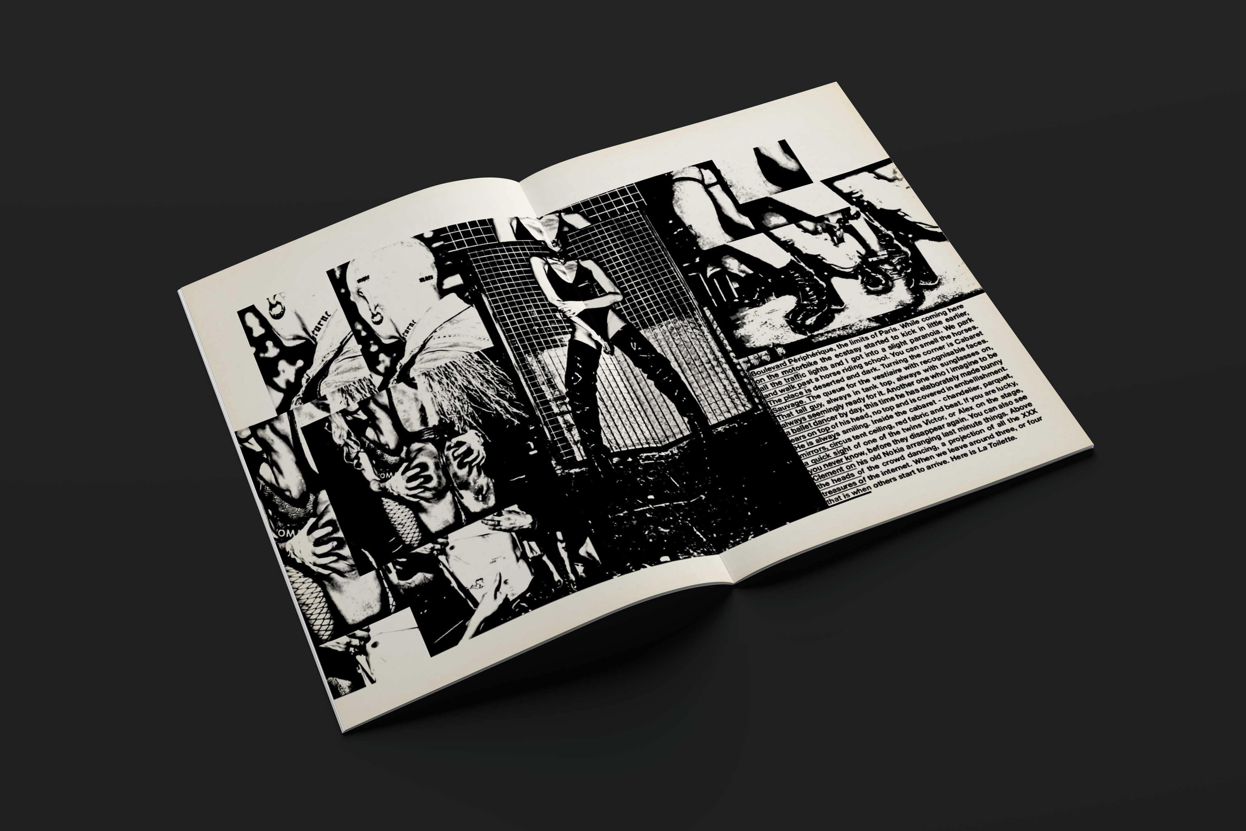
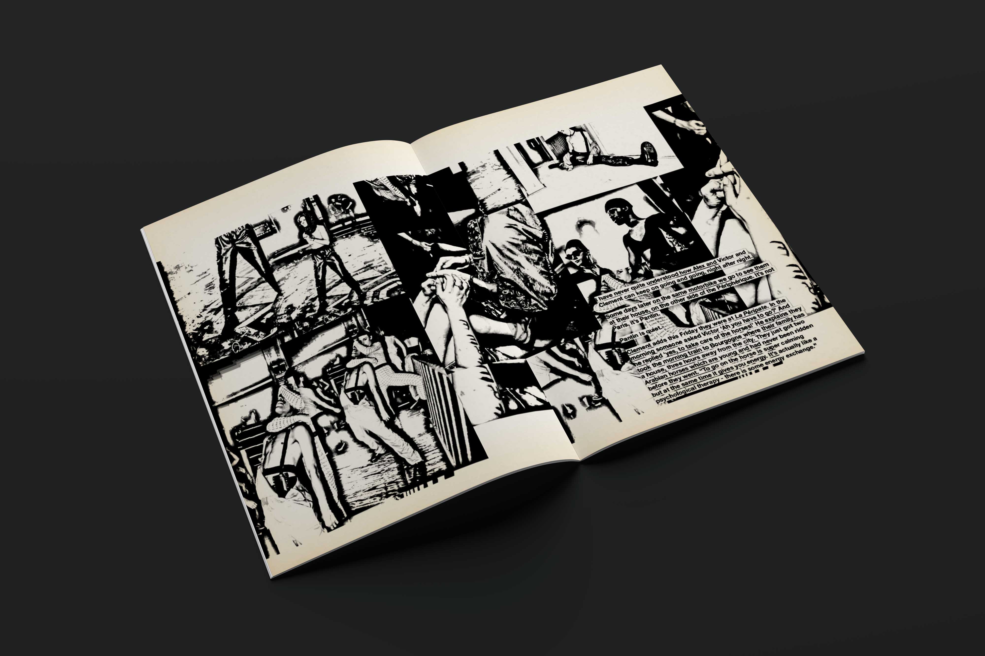
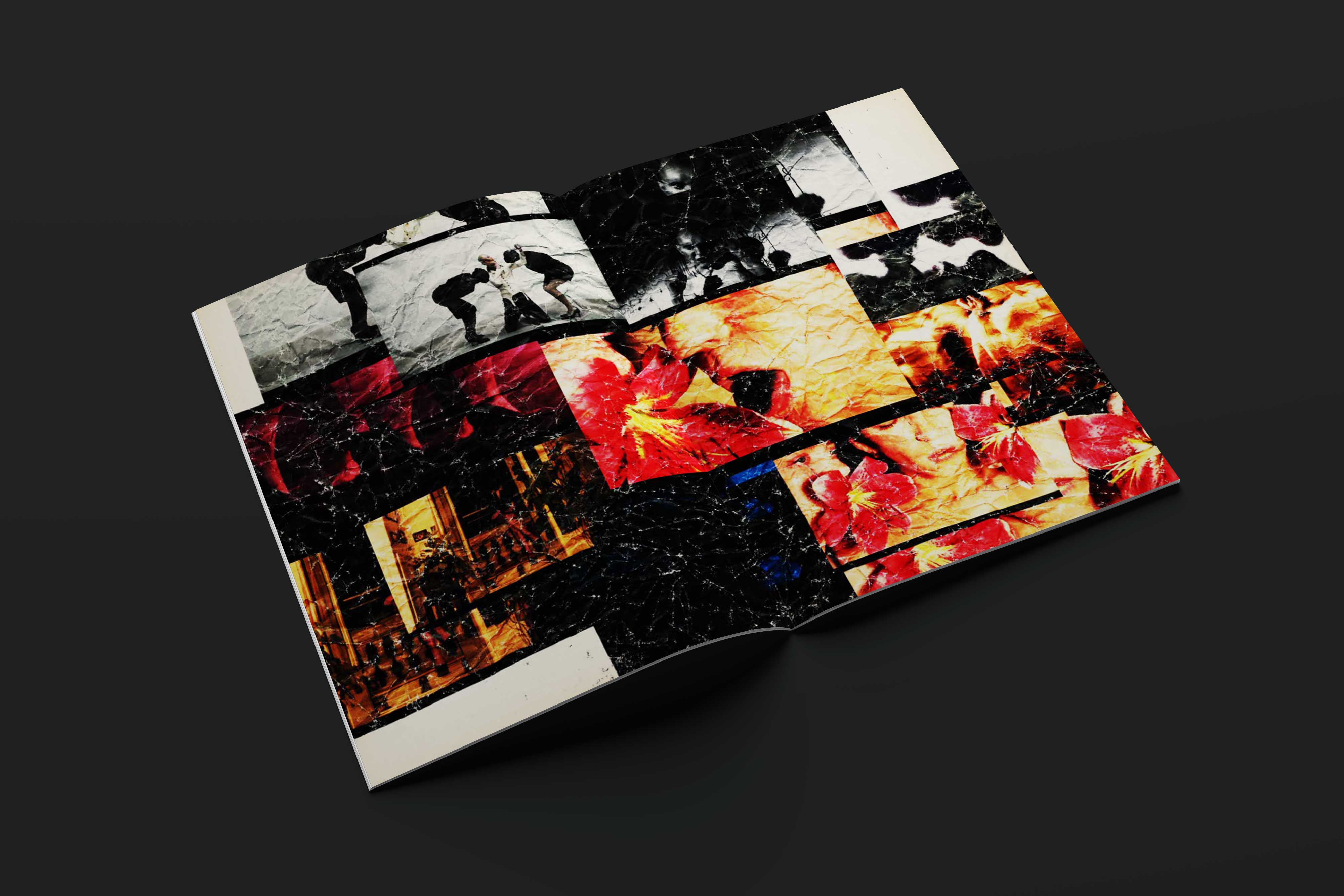
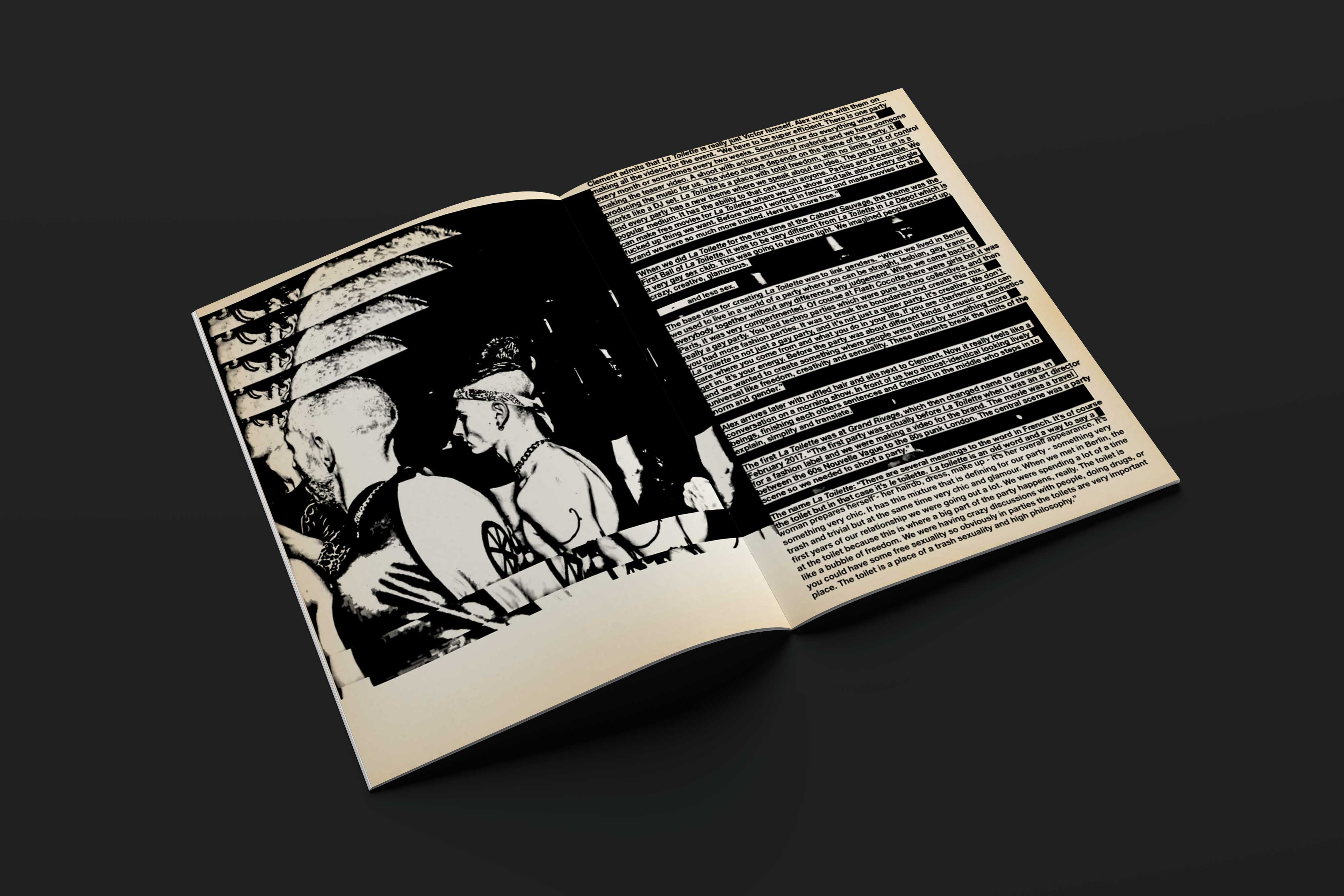
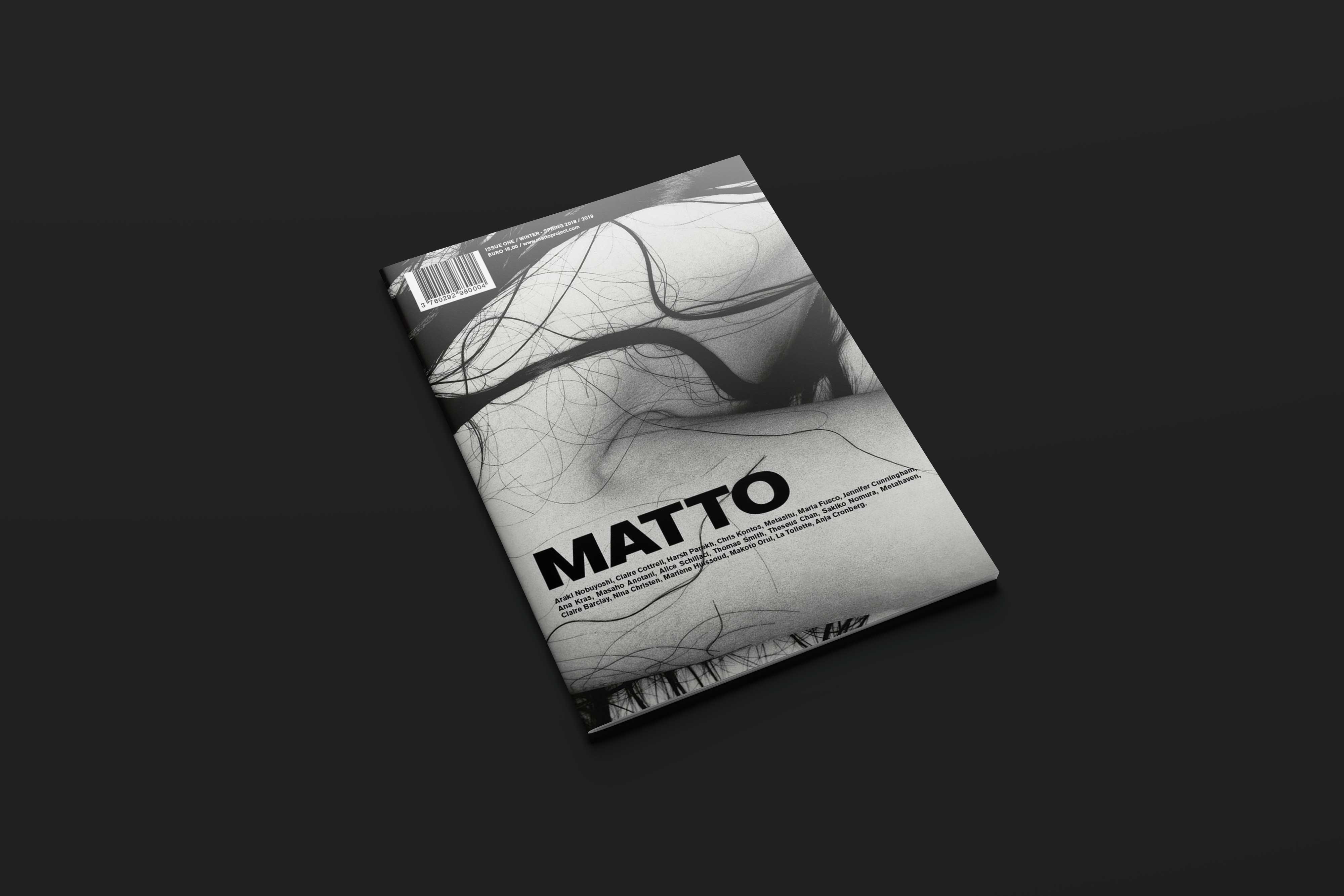
Taking its title from the Italian word for ‘crazy’, Matto is a bi-annual magazine that seeks to escape definition. Instead, it remains in a constant state of experimentation. This first issue takes readers across the globe to meet artists and creators whose work reflects the magazine’s primary goal: “to fluidly combine art-photography-literature-fashion-music-sex”.
Process
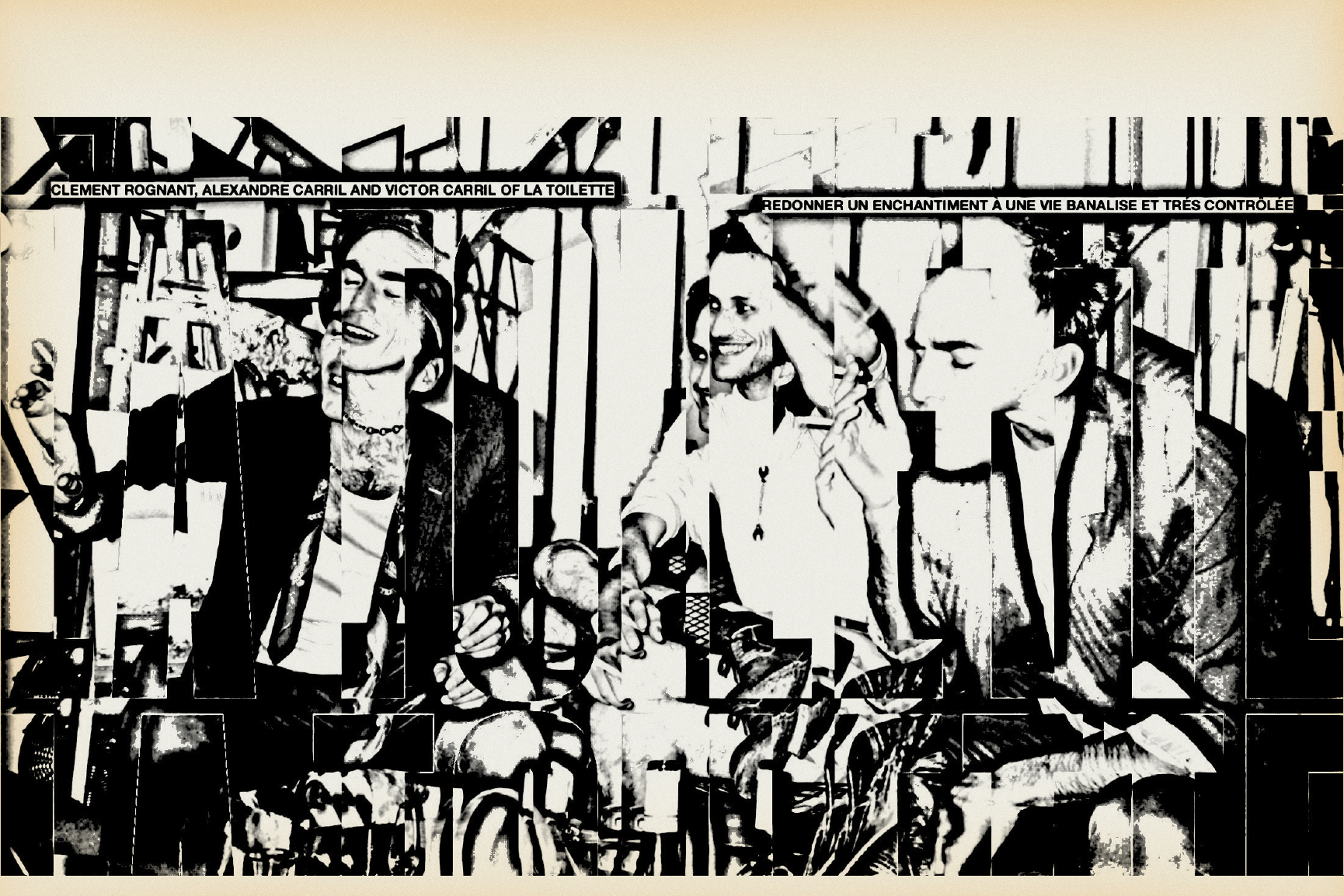
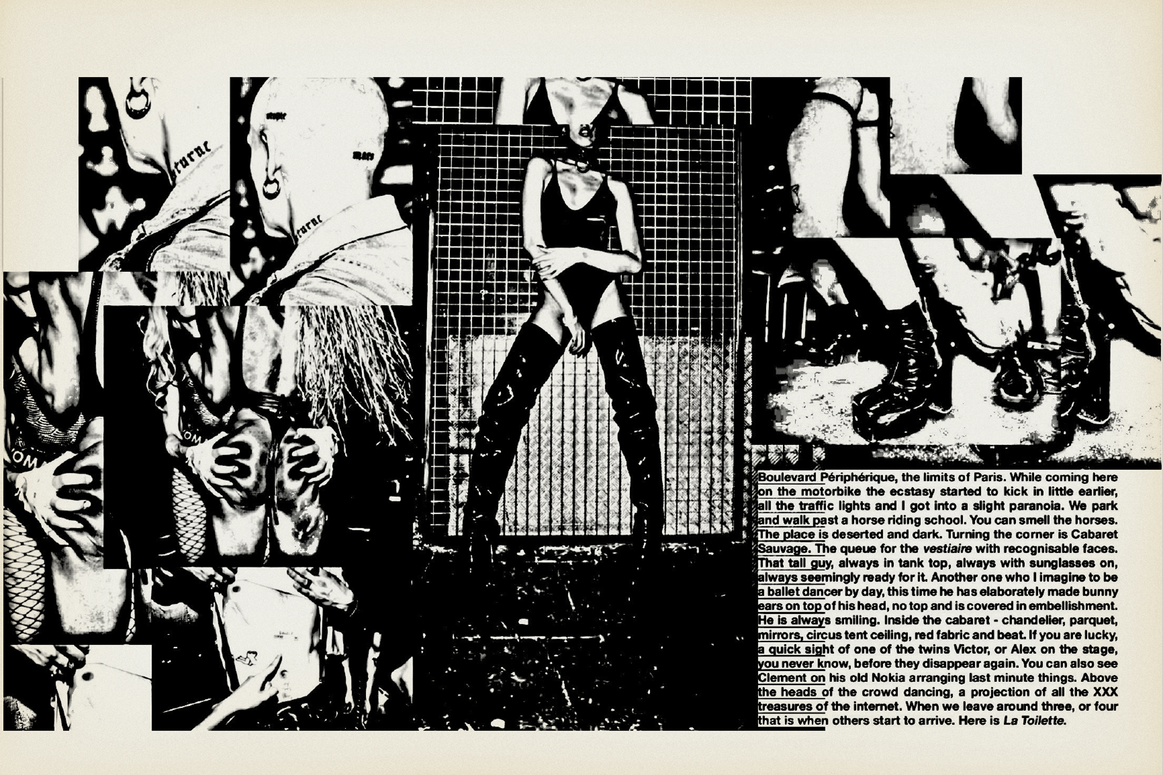
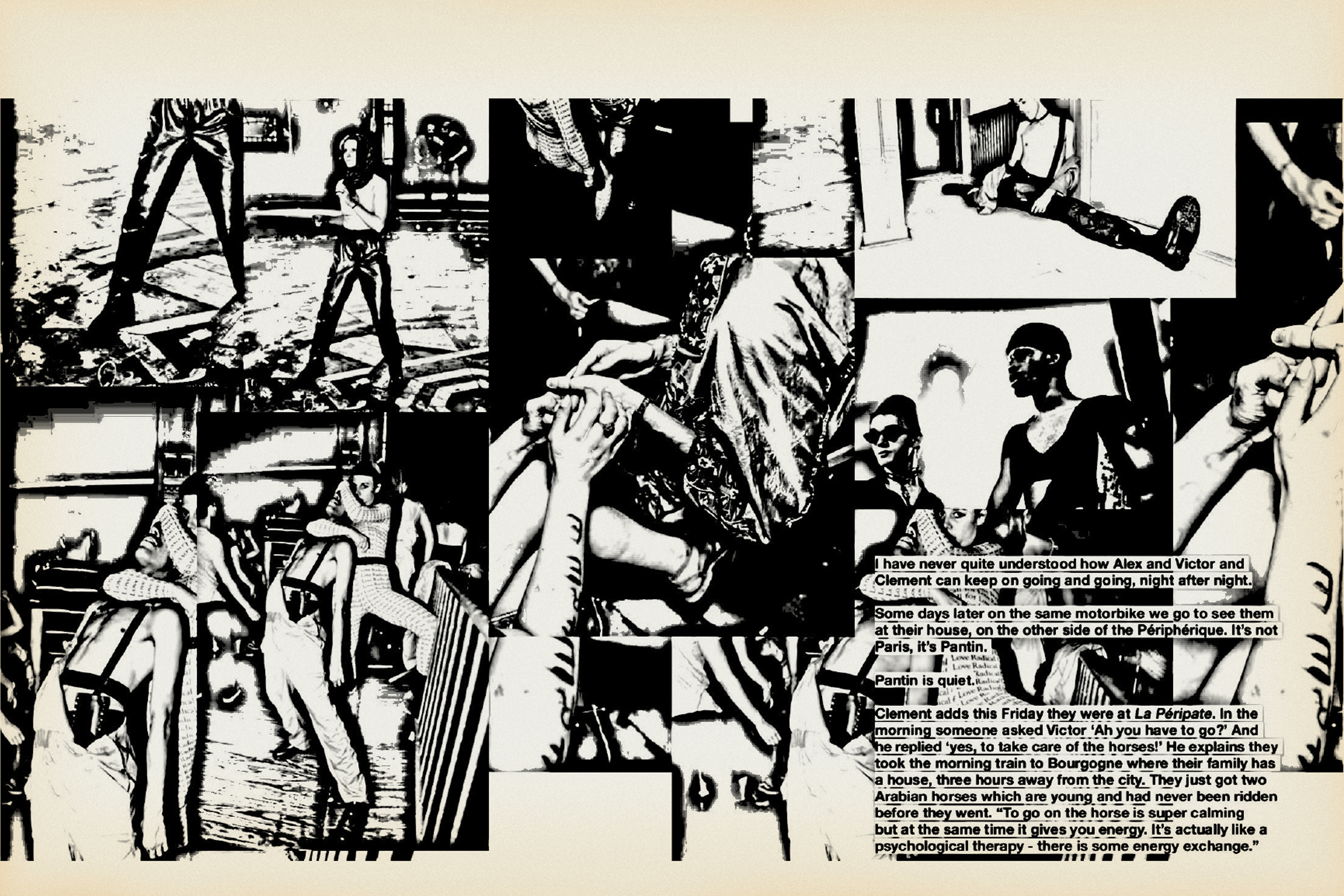
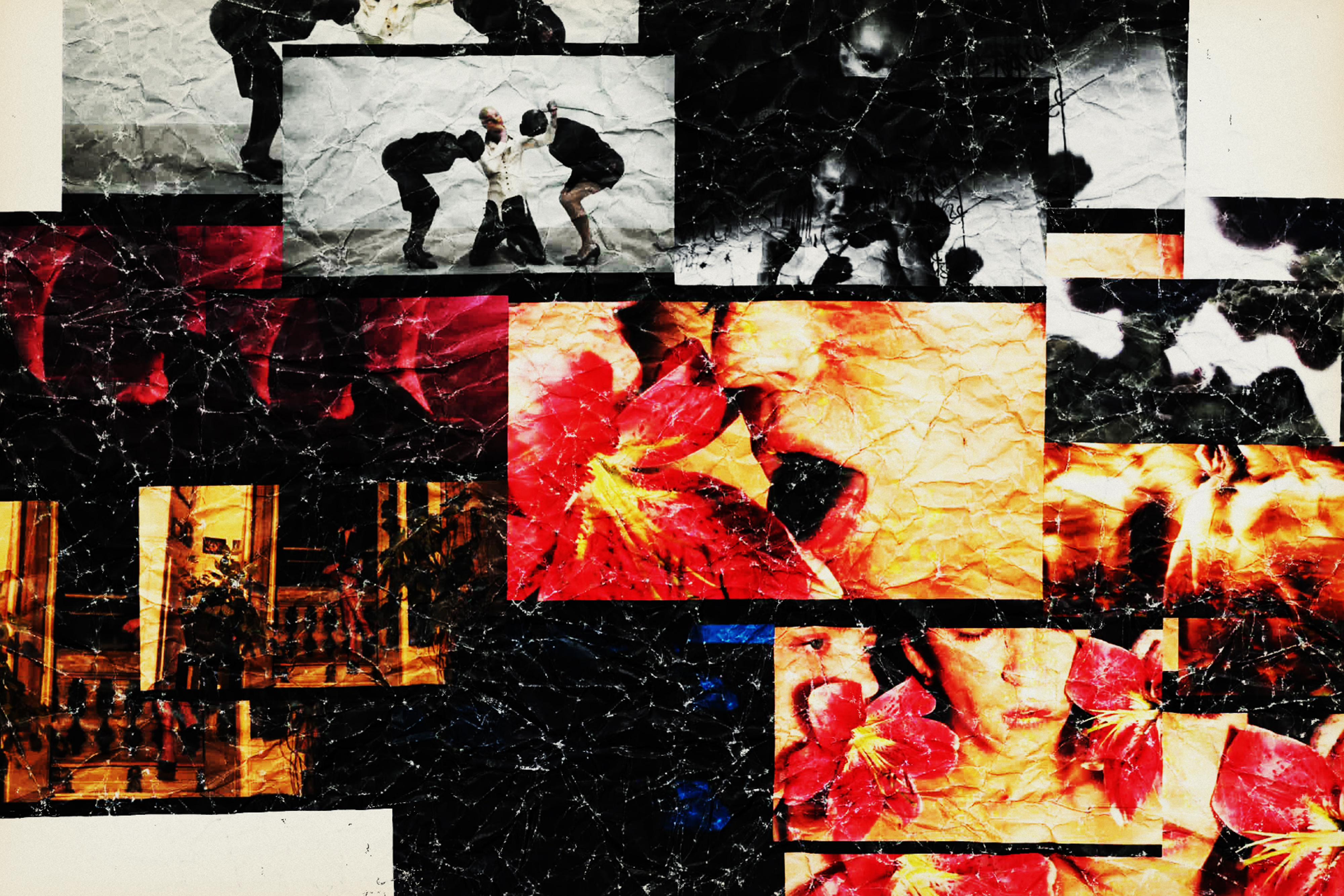
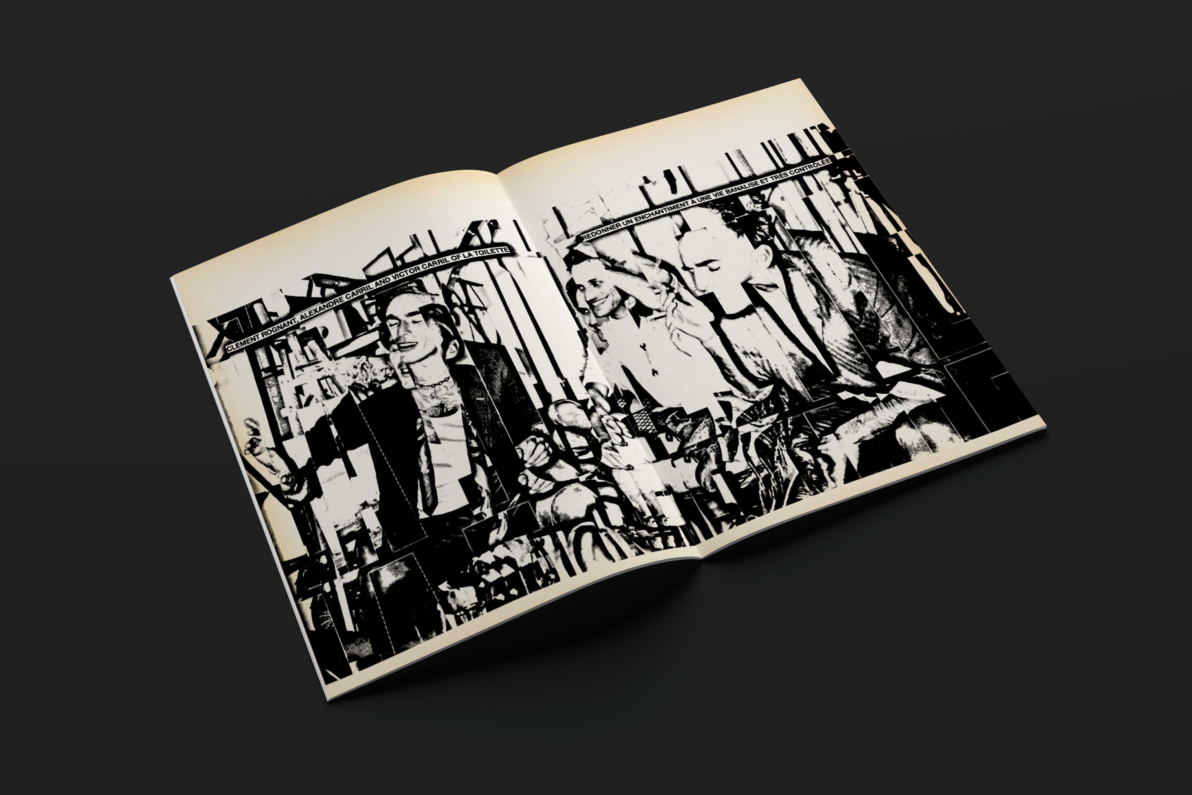
In collaboration with Aldo Buscalferri and Dominika Hadelova from MATTO Paris, six spreads of editorial content were designed for the first issue of MATTO Magazine. In response to the title/theme “crazy”, the layout was designed with visually striking ephemera from Britain's punk subculture. The layout was crafted digitally, printed out, aged with coffee and inks before being rescanned. It reflected a DIY spirit and instantly recognizable aesthetic that was as raw and strident and irrepressible as the music in late 1970s.