Case Study ︎︎︎
Gridiron
Client ︎︎︎ COMO
Client ︎︎︎ COMO
Roles
︎︎︎
Art Direction, Design
Agency ︎︎︎ WORK Pte Ltd
Agency ︎︎︎ WORK Pte Ltd
Brand Identity
Brief
Gridiron by COMO is a live-fire grill restaurant, showcasing a hearty menu of in-season, ethically-sourced ingredients. Meat, native fish and beautiful vegetables are given equal attention, prepared on an open grill to create delicate smoky flavours. You can watch the flames soar in the open-front kitchen. The brief was to create a brand identity that pays homage to the ancient art of grilling with its open kitchen format.
Solution
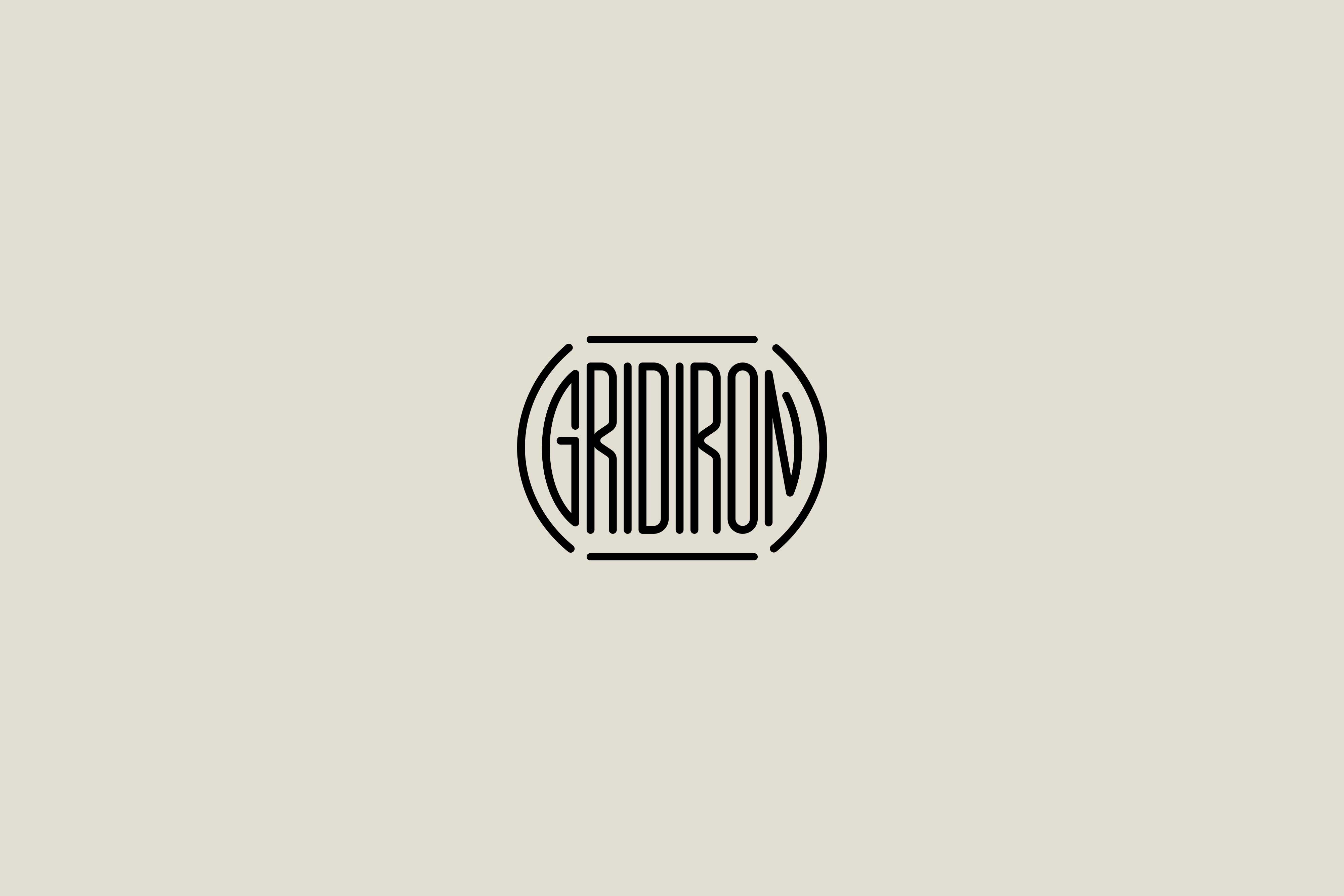
The visual language is established with the bespoke logotype, set in the friendly geometric sans serif wordmark that is crafted as a typographic play on the name that echoes the live-fire grill concept. The typography balances simple functionality of the grill with elegance. The Gridiron brand identity embraces this unique yet familiar vernacular—one that millennials are especially fluent in—to create a graphic language that feels fresh, open and engaging. The branding uses a limited color palette of grill-oriented orange, black and gray appears in skewed shades that feel more modern, to set Gridiron apart from other brands in the category.

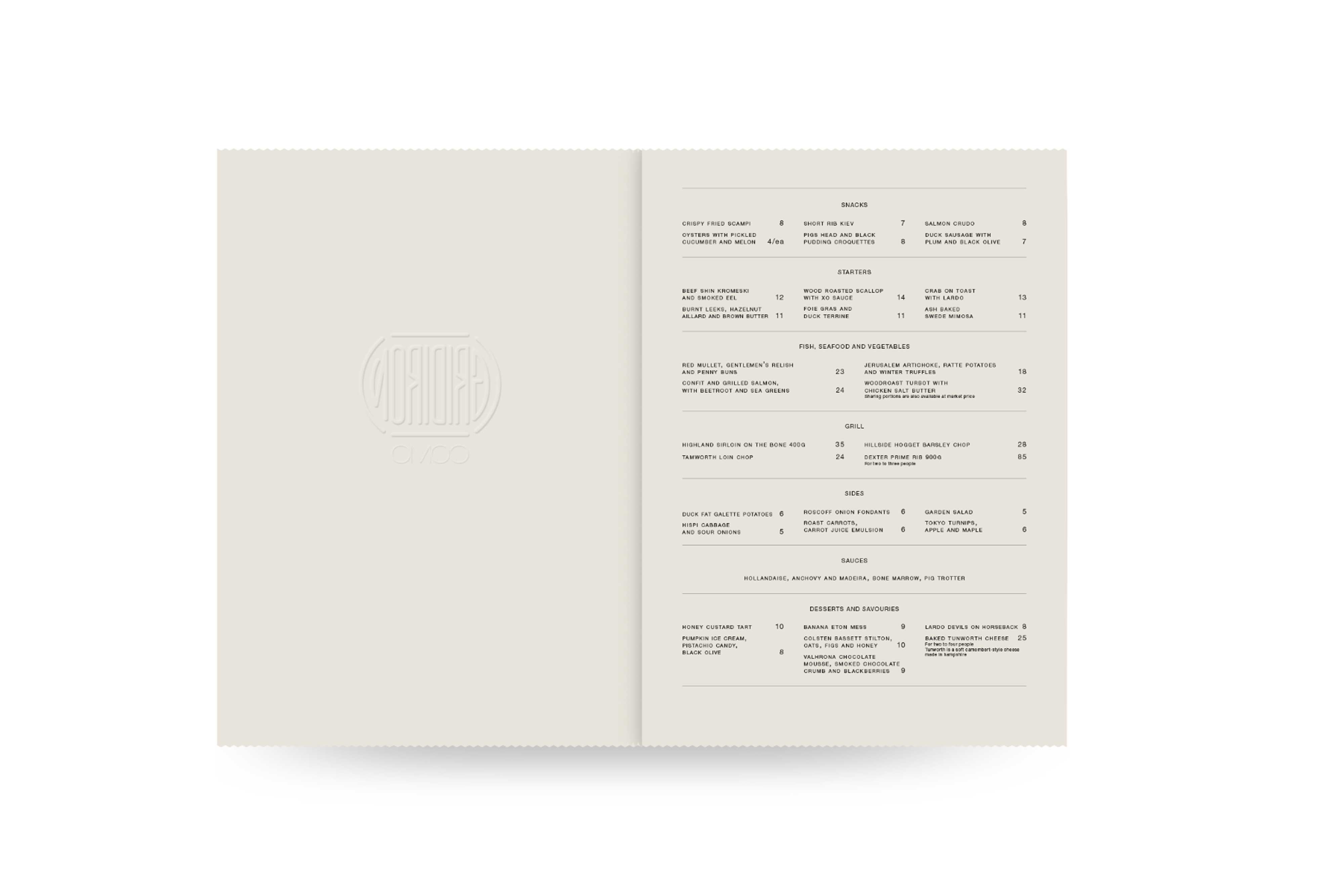
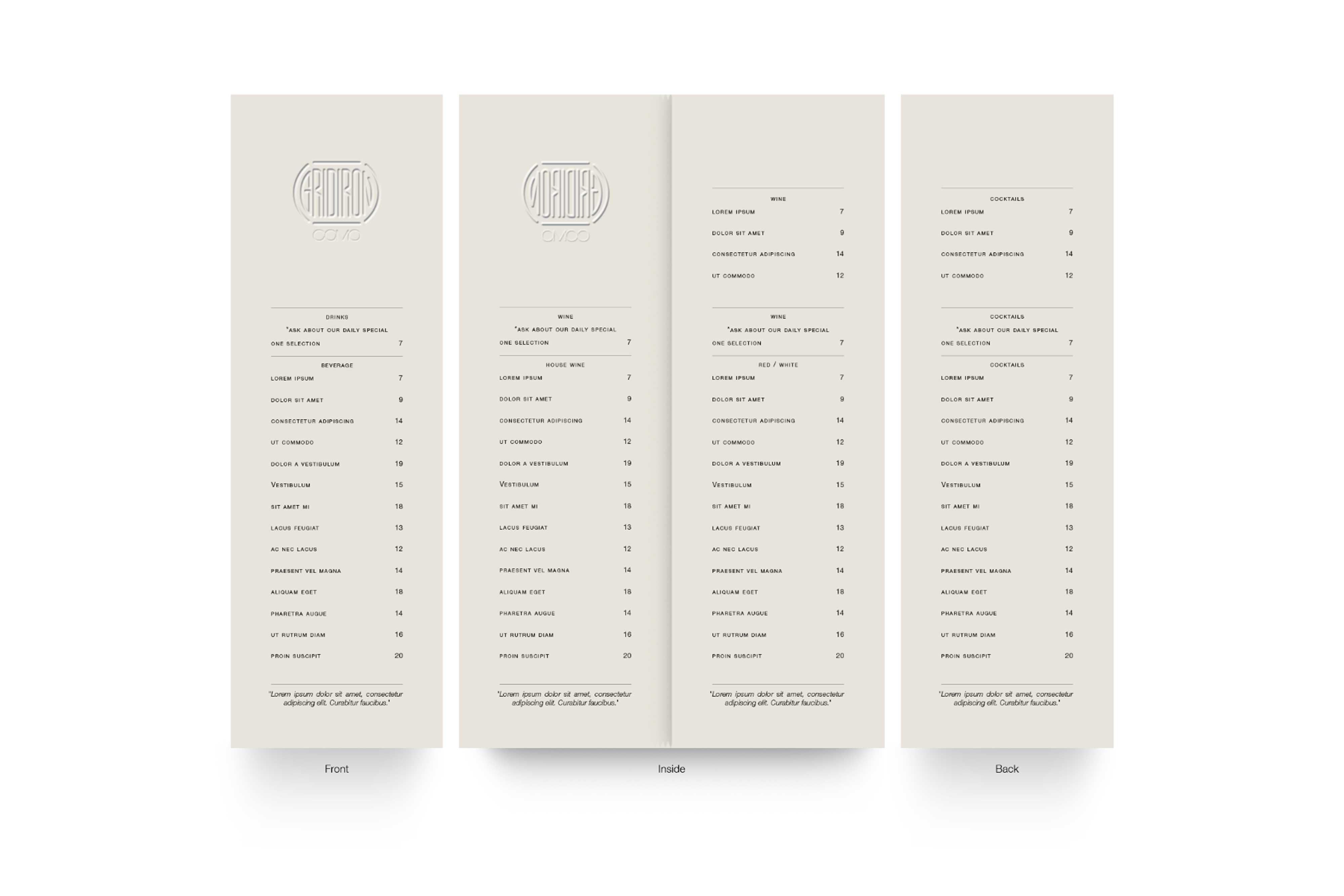
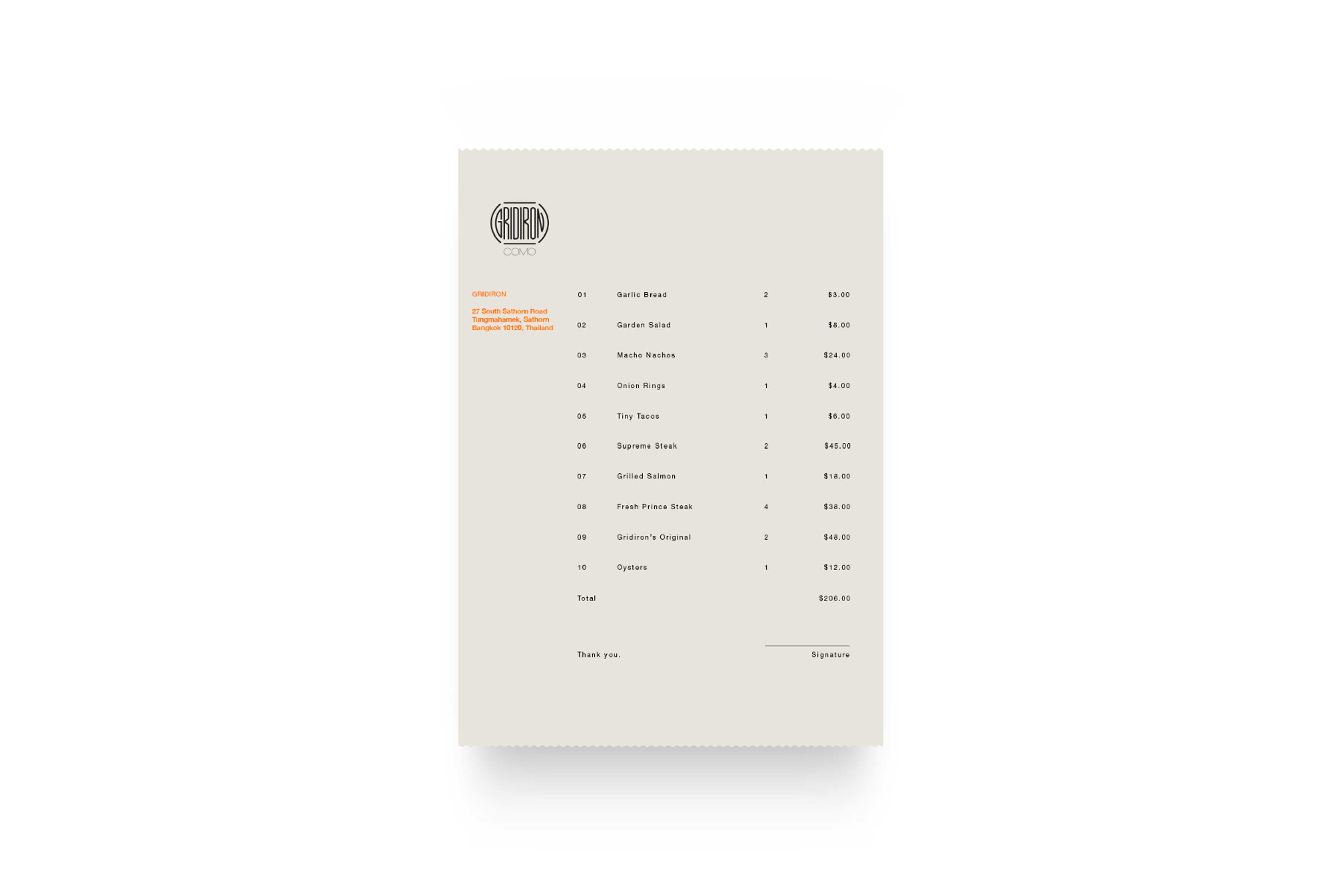
Food/Drinks Menu and Receipt

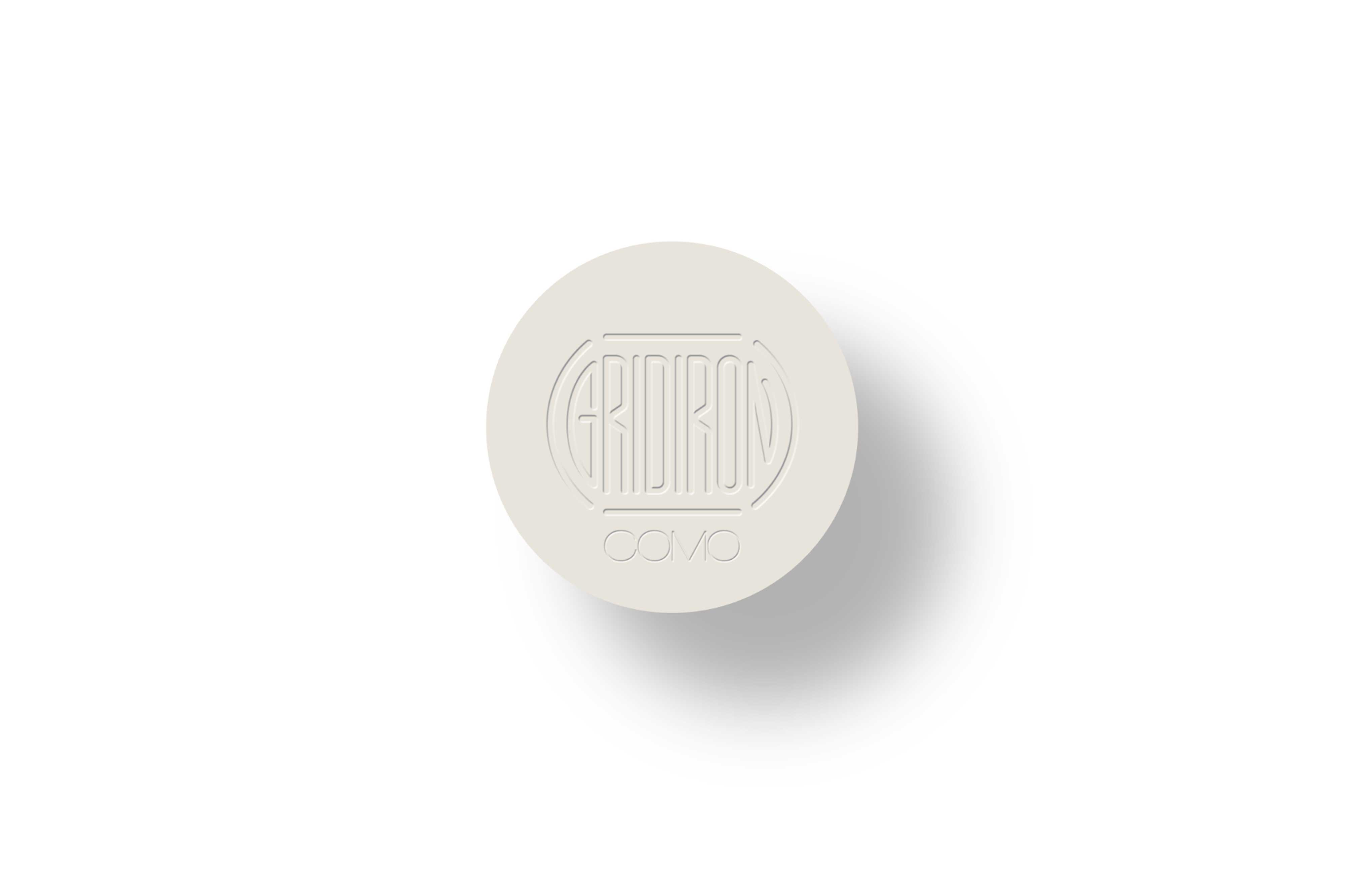
Brand Coasters
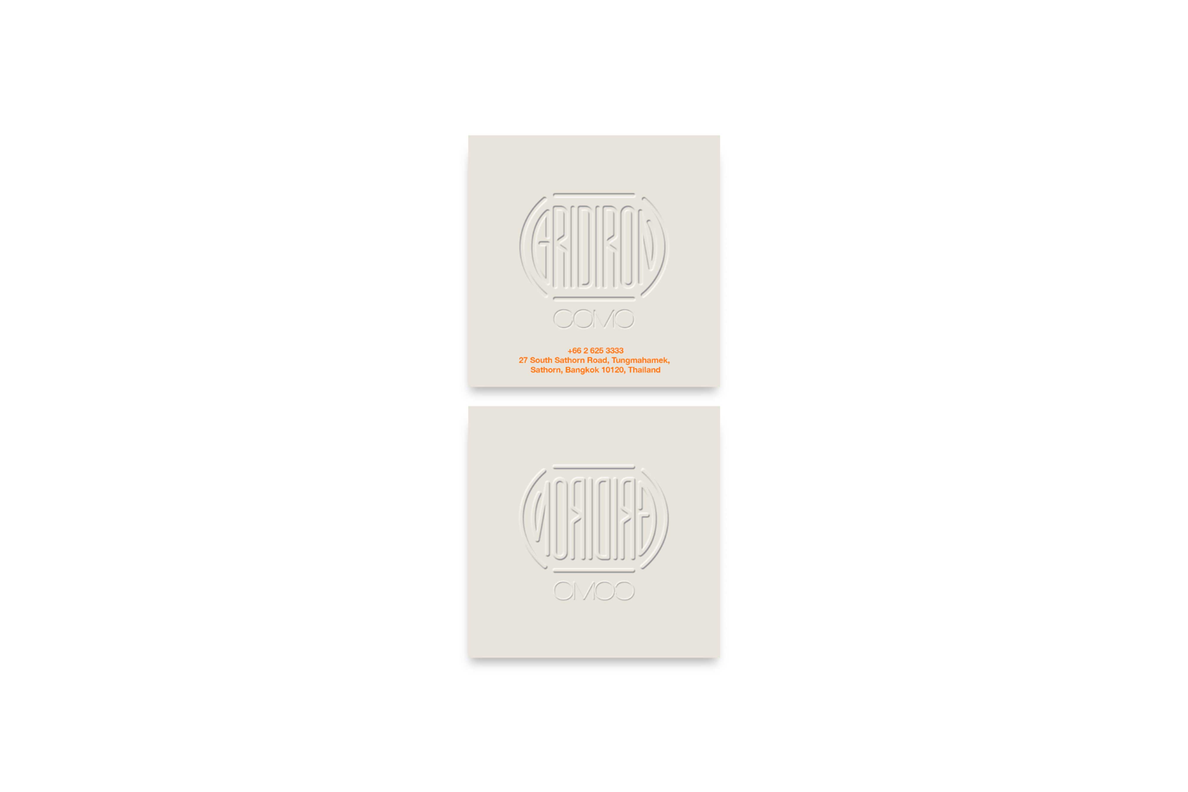
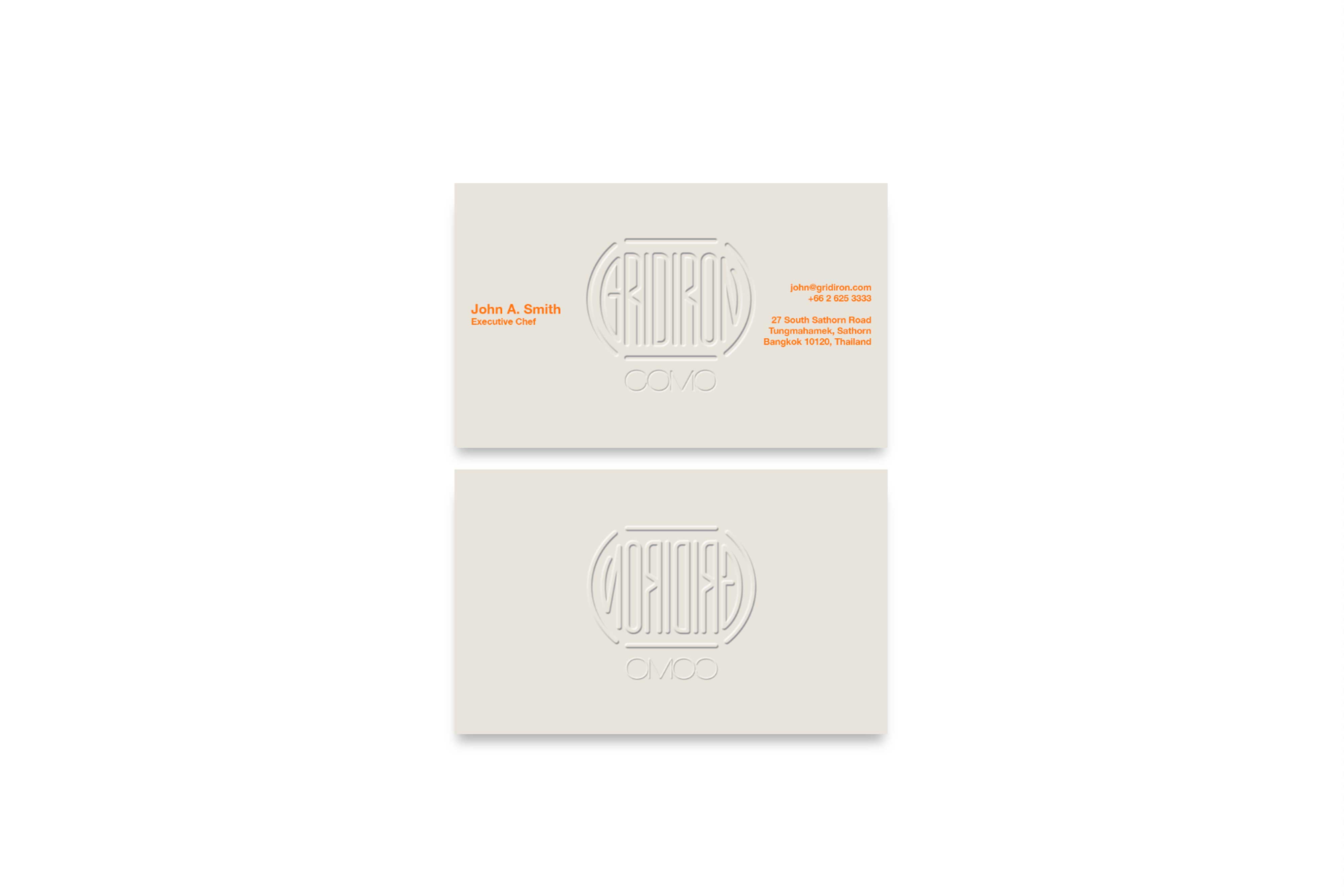
Business and Store Card


Letterhead and Envelope
